Appearance
Text
Words on the artboard: what they say, how they are set, and how they move.
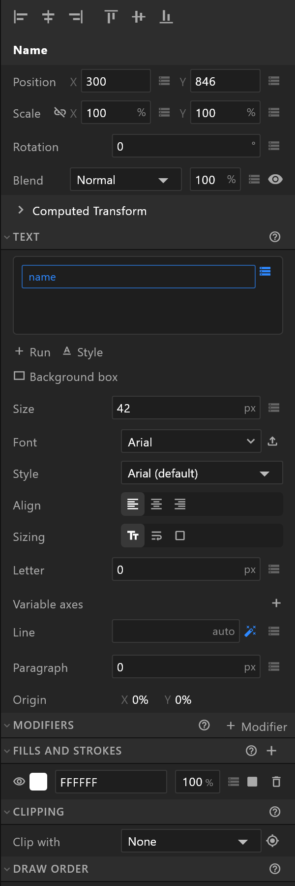
The text itself
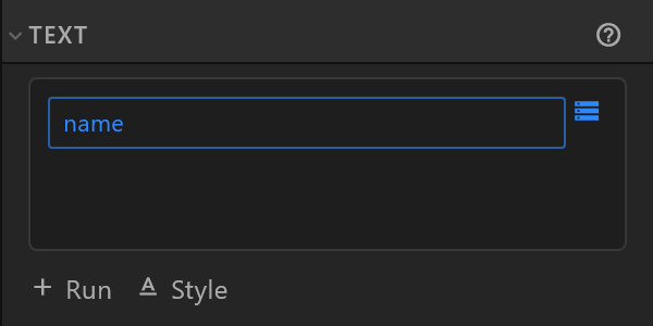
The box at the top of the Text section holds the words. Type into it, or edit them on the stage by double-clicking.
Beside the box are the diamond and the data glyph. Bind the text to a property and the box is replaced by the name of what fills it — this is how a name plate is filled from a rundown instead of typed.
Binding a number into text is offered too, with two extra rows so the number reads properly: Decimals (0 to 3) and Format — Round, Trim zeros, and a thousands separator.
Setting the type
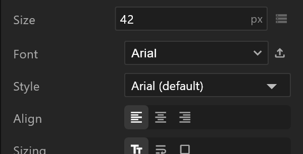
| Row | What it does |
|---|---|
| Size | Point size |
| Font | The family. The button beside it imports a font file that is not installed here |
| Style | The faces of that family, each drawn in itself |
| Weight | Only for a variable font, across the range that font offers |
| Align | Left, centre, right |
| Letter, Line, Paragraph | Space between letters, lines and paragraphs. Line reads auto until you set it; the wand puts it back to automatic |
| Variable axes | Extra axes a variable font defines, by their four-letter tag. Only axes the font has do anything |
| Origin | Where the text's anchor sits, as percentages. Read-only |
How the box behaves — the row that matters most

Sizing decides whether the text or the box is in charge, and it changes which other rows exist.
| Sizing | What it means | What it reveals |
|---|---|---|
| Auto width | The box is whatever the words need. Nothing wraps | — |
| Auto height (fixed width) | You set the width; the text wraps and the box grows down | Box width, Overflow, Wrap |
| Fixed box | You set both; the text is confined | Box width and height, Vertical, Overflow, Wrap |
For a graphic driven from a rundown, this is the decision that keeps a long name from breaking the design: a fixed box with Overflow set to Ellipsis cuts it politely, and Auto height lets it grow.
Runs and styles
A run is a stretch of text with its own style — the score in a different weight from the team name, in the same line. + Run adds one; the Runs section appears as soon as there is more than one, and each run can be bound to its own property.
A style is a named set of type settings that runs can share. + Style adds one. Each extra style has its own size, spacing, font and colour.
Split run cuts the text at the cursor into two runs. It is offered when the cursor is in the text and the text is not bound.
Background box

Background box puts a box behind the text that stretches to fit it, whatever the text says — while you type, and when a control system sends a longer name on air. The text sits in the middle of its padding.
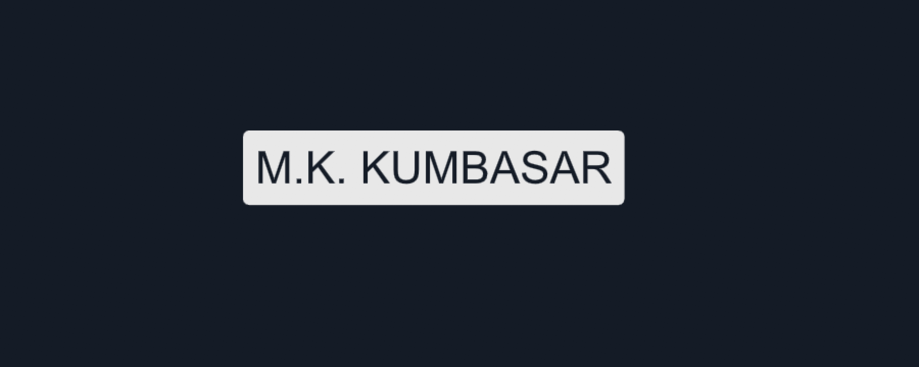
The box is a layer of its own, so you style it like any rectangle. Pressing the button adds two layers named after the text — for a text called Name:
| Layer | What it is |
|---|---|
| Name group | Holds the text and its box, and sets the padding between them. It hugs the text, so it grows and shrinks with it |
| Name | Your text, inside the group, where it was |
| Name box | The box itself, behind the text, so it is listed under it. Give it a fill, a stroke and corners like any rectangle |
It starts with 12 px of padding on every side, corners of 6 and a dark grey fill, and Name box is selected so you can style it straight away. It is one step to undo.
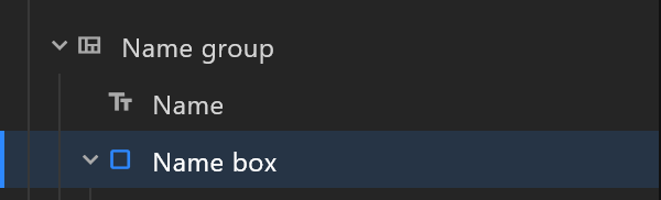
Moving it. Drag the text or the box on the stage, or nudge either with the arrow keys, and the whole thing moves together — the text never slides out of its box.
Coming back to it. Once a text has its box, the button reads Select its box and takes you to it.
Its size is not yours to type. The box's inspector has no Size row. It says instead what sizes it: "Sized by "Name group": it fits the text, with the padding set on the group." To make the box bigger around the text, select the group and change its Padding in the Layout section. The box also has no Slant, no Laid out switch and no Convert to path — each would stop it growing.
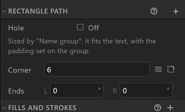
Slanted ends. The box's Ends L / R, in degrees, lean its two ends, and the ends travel with the text as it grows. Both at zero removes them. With ends, the box keeps its height and still fits the width of the text, and the panel says so: "With slanted ends the box keeps its height; its width still fits the text."
The box's corners go square on each side that carries an end, so the wedge and the box meet in one clean edge; a side without an end keeps its radius. With ends on both sides the box is square all round: the wedges are its ends. Taking both ends away rounds all four corners again.
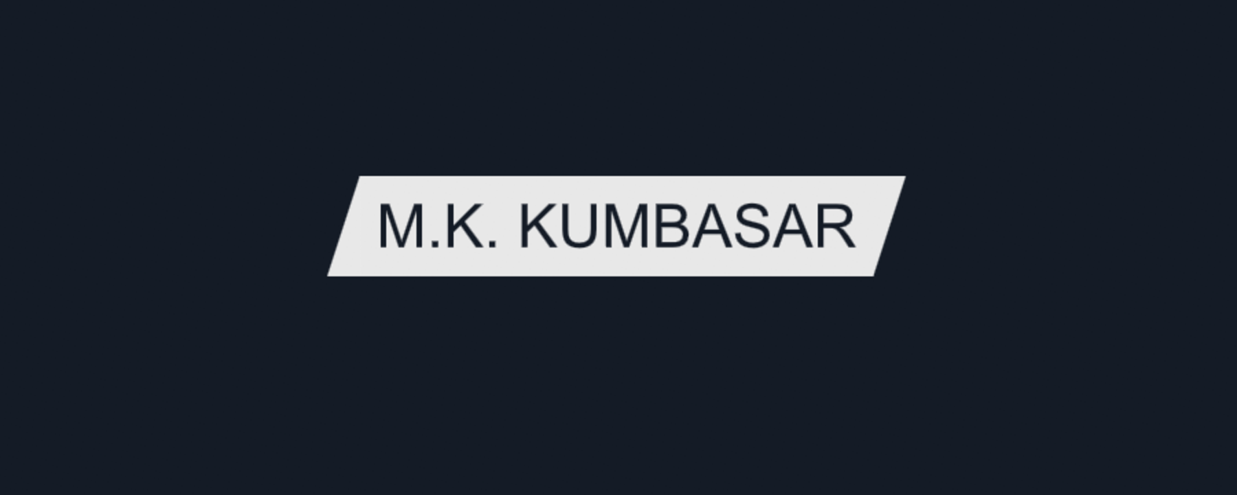
Changing the font, the size or the line height resizes the box and its ends to match.
Heights stay put
Accented capitals and descenders — İ, Ğ, Ç, Ş, Ö, Ü, and letters like g and y — never change a text box's height. Boxes stacked underneath do not shift when a name arrives with a different set of characters.
Modifiers
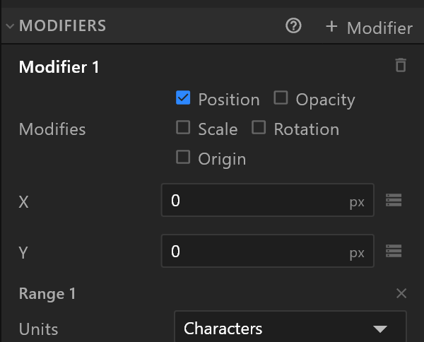
A modifier animates a range of characters rather than the whole text: a typewriter, letters dropping in, a wave.
Add one, then tick what it changes — Position, Opacity, Scale, Rotation, Origin — and each tick brings its own rows.
A range chooses which characters it applies to: by characters, words or lines, From and To, with Falloff to soften the edges and Offset to slide the whole selection along. The panel explains it in a line worth repeating:
Ranges select glyphs (characters, words, lines) between From and To; Offset slides the selection — key it from 0 % to 100 % for a typewriter; Falloff softens the edges.
Follow path lays the glyphs along a shape, with Start, End, Path offset and Path strength, and ticks for Radial and Orient.
Fills, strokes and the rest
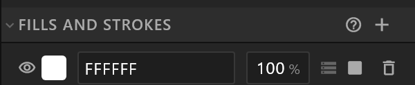
Text takes a fill and strokes like a shape, and has the same Clipping, Draw order, Computed and Constraints sections. A text fill can be feathered but not trimmed.
See also
- Fills and strokes · Layout, for text that must fit a space
- Build a lower third
- Fonts look wrong