Appearance
Clickable control panel
Buttons inside the graphic itself: press Show and the strap comes on, press Hide and it goes. For touch screens, and for graphics that react to a presenter.
The buttons change the graphic's data; the Animation States react to the data. So the same graphic works from a click and from the control system alike.
1. The property the buttons change
In the Data panel, add a Boolean property onAir (B). Wire your Animation States so the strap comes in when onAir is true and goes out when it is false — see Animate with Animation States.
2. The buttons
Draw two shapes with a text on each: Show and Hide.
3. What a click does
- Right-click the Show shape in the Hierarchy and choose Add listener ▸ › View Model Change, then
onAirunder Set which property. The listener is made — listening for a Click on the shape — and opens. - In its action, set the value to true:
set onAir to true. - Do the same for Hide, with false.
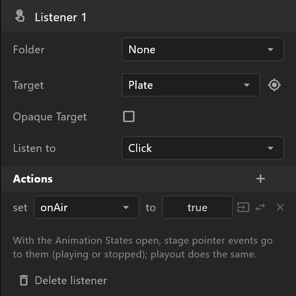
For a single button that turns it on and off, set the value to toggle — click the value to cycle true, false and toggle.
4. Make it feel like a button
- Opaque Target on a button stops a click from reaching what is behind it.
- A listener on Pointer Enter and another on Pointer Exit can set a
hoverproperty, and the button's colour can follow it.
5. Try it
Open the Animation States and press play. Clicks on the stage now go to the graphic: press Show, and the strap comes in; the state changes log says so.