Appearance
Layout
A box that arranges what is inside it, so a graphic fits its content instead of you nudging things.
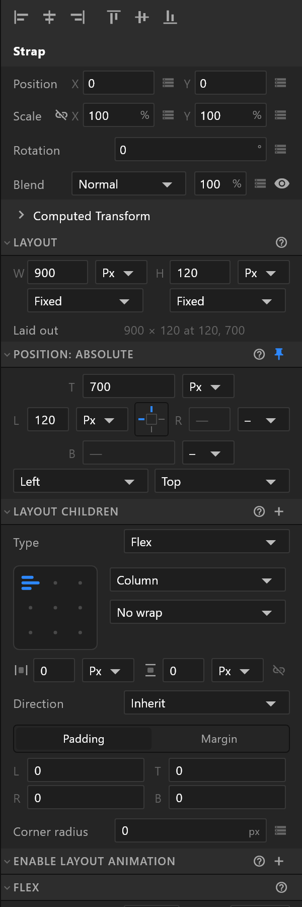
Why use one
A name plate whose background fits the name. A row of chips that spaces itself. A table whose rows stack. Anything that has to survive text you did not write — because at air time, the text comes from the rundown.
Size
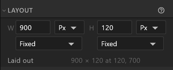
Each direction has a value, a unit and a behaviour.
| Behaviour | What it means |
|---|---|
| Fixed | The size you typed |
| Fill | Takes what the parent has spare |
| Hug | Shrinks to what is inside. The value field goes quiet — it is not yours to set |
Units are pixels, a percentage, or Auto. Laid out underneath reads back what the layout actually came out as, once everything has been arranged.
Where it sits
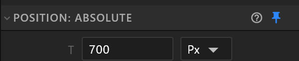
The heading says which of two ways this layout is placed:
- Position: constrained by parent — the parent layout places it. Its X and Y offset it from that slot, and a note under the transform rows says so.
- Position: absolute — pinned. Use the pin button in the heading, and four edge fields appear, laid out like a box: T, L, R, B. Each can be pixels, a percentage, or
–for "not pinned on that edge", and two dropdowns say which edges to hold.
Arranging what is inside
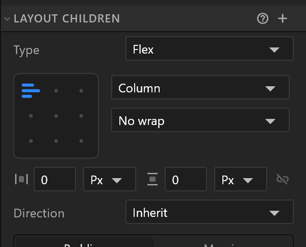
Type — Flex (a row or a column), Grid (columns and rows you define), or Stack (everything on top of everything).
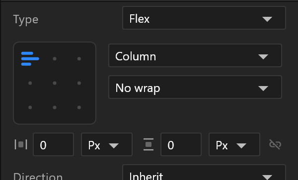
The 3 × 3 pad sets alignment in both directions at once: click where the content should sit. The cell you click is where the children go on screen, even in a reversed row or column.
The pad has a key diamond, so alignment can be animated: key a card in the middle of its frame, move the playhead, click the top cell, and it moves up.
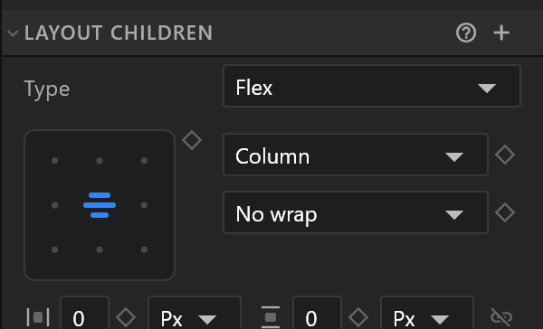
Beside the pad: the direction — Row, Column, or either reversed — and whether content wraps.
| Row | What it does |
|---|---|
| Gap | Space between children. Link the two to keep them equal |
| Padding / Margin | Space inside the box, and outside it. Two tabs, four fields each |
| Corner radius | Rounds the layout's own box |
| Direction | Inherit, left to right, or right to left — for languages that run the other way |
Grid adds Columns and Rows sections, each track sized Auto, in pixels, as a percentage, or in fractions (fr) of what is left. A child of a grid gets its own Grid cell rows: column, row, and how many of each it spans.
Under Show advanced distribution: Justify and Align in full, for the cases the pad cannot express — Space between, Space around, Space evenly, Baseline.
Flex
| Row | What it does |
|---|---|
| Grow / Shrink | How eagerly this layout takes spare space, or gives it up |
| Self align | Overrides the parent's alignment for this one child |
| Display | Flex or None. This row can be bound, which is how a data-driven panel collapses a row that has nothing to say — the space closes up as though it were never there |
| Clip | Whether children are cut off at the box |
| Artboard list | Adds a list that draws one artboard per item of a bound List property |
Moving when the content changes

Layout animation eases a layout into its new slot instead of jumping, when something above it grows or disappears. Turn it on and choose the easing and the time; or inherit them from the parent.
This is what makes a data-driven board feel designed rather than reflowed.
Fills, and clipping them
A layout takes fills and strokes like anything else. Its paint options also offer Foreground, which paints over the children rather than behind them.
When you clip a layout, one extra row appears, and it matters:
- Background ticked: the layout's own fill and stroke are clipped along with the contents.
- Unticked, the panel warns: "Only what is inside the layout is clipped: its own fill and stroke paint in full. Tick Background to clip those too."
Slanted ends
A filled layout containing a text is a background box, and it gets Ends L / R in degrees — the slanted ends of a broadcast bar, which travel with the box as the text grows.
See also
- Layouts · Artboard list
- Text, for text that must fit
- Build a lower third