Appearance
Operator panels
A panel of your own design for filling in a template: the fields, lists and buttons an operator needs, and nothing else.
Without a panel, Item Configuration lists a template's values one by one. With one, it shows the controls you designed: text fields, lists filled from a spreadsheet or database, buttons that fire triggers, timers and clocks.
Design a panel
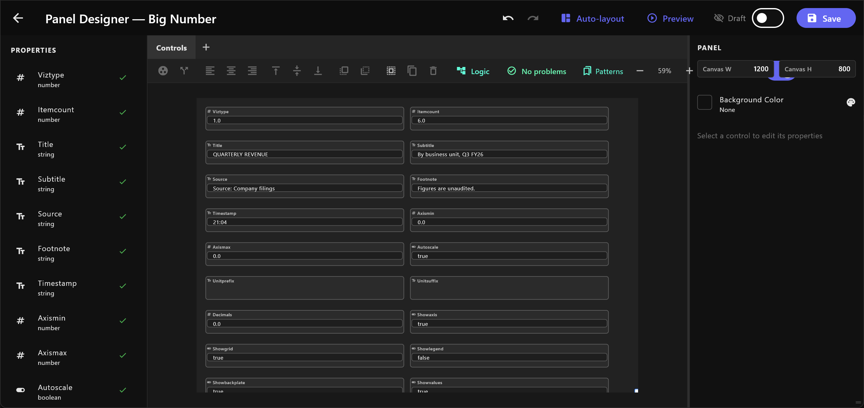
Open the template's details and select Design Operator Panel. The Panel Designer opens. Auto-layout lays out a control for every value of the template, in two columns: start from that, or build your own.
| Area | What it holds |
|---|---|
| PROPERTIES (left) | The template's values. Drag or click one to add a control for it. A tick means it is already on the panel. |
| WIDGETS (left) | Controls that are not tied to one value: Label, Description, Timer, Clock, Database, Menu (custom), List. |
| Canvas (middle) | The panel itself, in tabs. Add tab adds one; double-click a tab to rename it. |
| Inspector (right) | The selected control's settings: its label, description, default, the kind of control, size and limits. |
The canvas works as in a design tool: drag to move, drag on empty space to select several, Ctrl+A selects all, arrow keys nudge, Ctrl+D duplicates, Ctrl+Z and Ctrl+Y undo and redo. The toolbar aligns, groups and orders controls, and zooms.
Preview shows the panel as an operator will see it. Save keeps it; nothing is saved until you do.
Make it available
The switch at the top reads Draft until you turn it to Available to operators. Only then do items made from the template show the panel; until then they show the plain list of values.
Lists and menus from data
A drop-down, radio group or List can take its choices from a spreadsheet, a database file or a database server: turn on From data source under ITEMS. Every setting is explained in Choices from data.
Lists that depend on each other
To show, for example, only the districts of the chosen city, set the district list's Filter by to its city column, open Logic, and wire the city list's Value into the district list's city input. The district list reads its source again whenever the city changes.
The designer checks the panel as you build: the check button in the toolbar reads No problems, or lists what is wired wrongly, such as a list filtered by the text shown instead of the value.
Use a panel on air
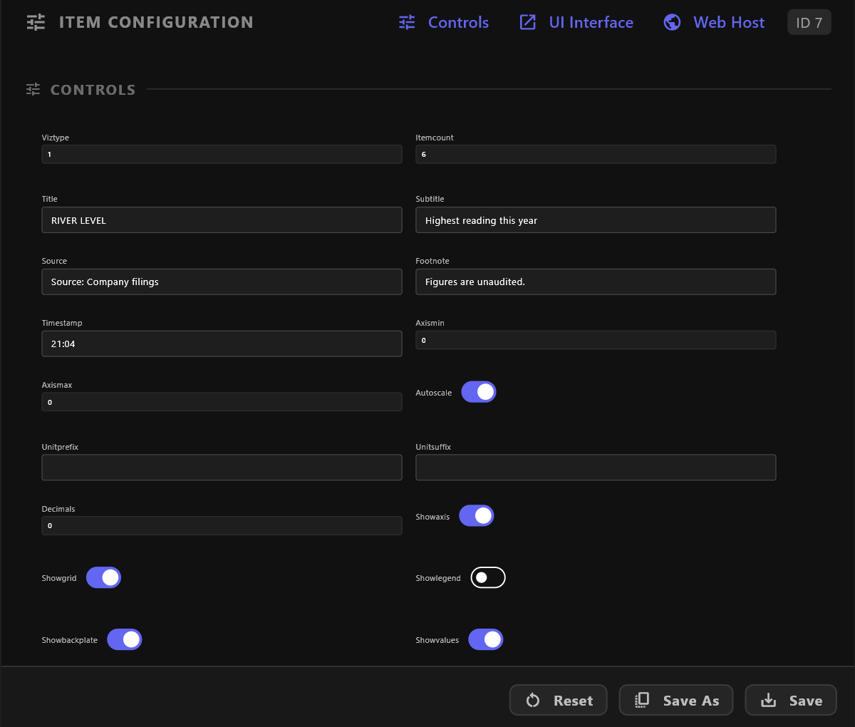
Select an item made from the template. Its panel appears in three places:
| Where | How |
|---|---|
| Item Configuration | The controls appear under CONTROLS, in place of the plain values. |
| Controls | Opens the panel over the window. |
| UI Interface | Opens the panel in a window of its own, for a second screen. It follows the item you select in the rundown, and Previous item / Next item step through the rundown. |
Staged, On Air and Armed
A panel works in one of three ways, chosen at its bottom:
| Mode | What an edit does |
|---|---|
| Staged | Changes the preview and the item. Nothing goes to air. |
| On Air | Holds edits until a trigger fires, or until you press Update On-Air. |
| Armed | Every change goes to air at once. |
Panels open in Staged.
Choices, not values
For a list filled from data, the item keeps the choice the operator made, not the numbers it resolved to. When the panel opens again, the list reads its source again and picks the same choice, so the values are current.
If the saved choice is no longer in the data, nothing is selected: the list has an amber border, and its tooltip says to choose again before air.
When the list a dependent list depends on changes, and the old choice is not among its new rows, the dependent list is left empty and asks for a choice: a list gets an amber border and a hand mark, a drop-down reads Choose… in amber. Its tooltip says why. airZ Controller never picks a row for you. Until you choose, the item keeps the value it had: its row in the rundown says CHOOSE BEFORE AIR, even with the panel closed, and taking it in asks first (Nothing chosen yet: Choose first or Take anyway). Taking it out never asks.
If a source cannot be read, a red banner says Database unreachable: the lists show the last values read, which may be out of date. Select Retry.
Choices from the browser
Journalists in the web rundown see an item's data-backed choices as drop-down lists, and can change them. Controls that need the desktop panel, such as timers and clocks, say so.
See also
- Panel logic: every node, and how to wire them
- A template's details
- Item configuration